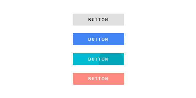
Пример создания эффекта пульсации для кнопок (Android L Ripple Effect).
Эффект создается с помощью CSS3 и JS.
Установка
HTML
CSS
JS
Эффект создается с помощью CSS3 и JS.
Установка
HTML
Код
<div id="wrap">
<div>
<script async="" src="//pagead2.googlesyndication.com/pagead/js/adsbygoogle.js"></script>
<!-- 300x250 orange media and text -->
<ins class="adsbygoogle" style="display:inline-block;width:300px;height:250px" data-ad-client="ca-pub-1961147311692851" data-ad-slot="7771578127"></ins>
<script>(adsbygoogle=window.adsbygoogle||[]).push({});</script>
</div> <h1>Android L Ripple Effect</h1>
<div id="main">
<button>BUTTON</button>
<button>BUTTON</button>
<button>BUTTON</button>
<button>BUTTON</button>
</div>
</div>
CSS
Код
body {
margin: 0;
padding: 0;
}
#wrap {
position: absolute;
width: 100%;
height: 100%;
display: -webkit-box;
display: -webkit-flex;
display: -ms-flexbox;
display: flex;
-webkit-flex-flow: column;
-ms-flex-flow: column;
flex-flow: column;
-webkit-box-pack: center;
-webkit-justify-content: center;
-ms-flex-pack: center;
justify-content: center;
-webkit-box-align: center;
-webkit-align-items: center;
-ms-flex-align: center;
align-items: center;
}
h1 {
display: -webkit-box;
display: -webkit-flex;
display: -ms-flexbox;
display: flex;
margin: 0;
padding: 0;
-webkit-box-align: center;
-webkit-align-items: center;
-ms-flex-align: center;
align-items: center;
-webkit-box-flex: 2;
-webkit-flex: 2;
-ms-flex: 2;
flex: 2;
}
#main {
-webkit-box-flex: 5;
-webkit-flex: 5;
-ms-flex: 5;
flex: 5;
}
button {
position: relative;
display: block;
width: 13em;
height: 3em;
margin: 2em;
border: none;
outline: none;
letter-spacing: .2em;
font-weight: bold;
background: #dfdfdf;
cursor: pointer;
overflow: hidden;
-webkit-user-select: none;
-moz-user-select: none;
-ms-user-select: none;
user-select: none;
border-radius: 2px;
}
button:nth-child(2) {
color: #fff;
background: #4285f4;
}
button:nth-child(3) {
color: #fff;
background: #00bad2;
}
button:nth-child(4) {
color: #fff;
background: #ff8a80;
}
.ripple {
position: absolute;
background: rgba(0,0,0,.15);
border-radius: 100%;
-webkit-transform: scale(0);
-ms-transform: scale(0);
transform: scale(0);
pointer-events: none;
}
.ripple.show {
-webkit-animation: ripple .75s ease-out;
animation: ripple .75s ease-out;
}
@-webkit-keyframes ripple {
to {
-webkit-transform: scale(2);
transform: scale(2);
opacity: 0;
}
}
@keyframes ripple {
to {
-webkit-transform: scale(2);
transform: scale(2);
opacity: 0;
}
}
margin: 0;
padding: 0;
}
#wrap {
position: absolute;
width: 100%;
height: 100%;
display: -webkit-box;
display: -webkit-flex;
display: -ms-flexbox;
display: flex;
-webkit-flex-flow: column;
-ms-flex-flow: column;
flex-flow: column;
-webkit-box-pack: center;
-webkit-justify-content: center;
-ms-flex-pack: center;
justify-content: center;
-webkit-box-align: center;
-webkit-align-items: center;
-ms-flex-align: center;
align-items: center;
}
h1 {
display: -webkit-box;
display: -webkit-flex;
display: -ms-flexbox;
display: flex;
margin: 0;
padding: 0;
-webkit-box-align: center;
-webkit-align-items: center;
-ms-flex-align: center;
align-items: center;
-webkit-box-flex: 2;
-webkit-flex: 2;
-ms-flex: 2;
flex: 2;
}
#main {
-webkit-box-flex: 5;
-webkit-flex: 5;
-ms-flex: 5;
flex: 5;
}
button {
position: relative;
display: block;
width: 13em;
height: 3em;
margin: 2em;
border: none;
outline: none;
letter-spacing: .2em;
font-weight: bold;
background: #dfdfdf;
cursor: pointer;
overflow: hidden;
-webkit-user-select: none;
-moz-user-select: none;
-ms-user-select: none;
user-select: none;
border-radius: 2px;
}
button:nth-child(2) {
color: #fff;
background: #4285f4;
}
button:nth-child(3) {
color: #fff;
background: #00bad2;
}
button:nth-child(4) {
color: #fff;
background: #ff8a80;
}
.ripple {
position: absolute;
background: rgba(0,0,0,.15);
border-radius: 100%;
-webkit-transform: scale(0);
-ms-transform: scale(0);
transform: scale(0);
pointer-events: none;
}
.ripple.show {
-webkit-animation: ripple .75s ease-out;
animation: ripple .75s ease-out;
}
@-webkit-keyframes ripple {
to {
-webkit-transform: scale(2);
transform: scale(2);
opacity: 0;
}
}
@keyframes ripple {
to {
-webkit-transform: scale(2);
transform: scale(2);
opacity: 0;
}
}
JS
Код
var addRippleEffect = function (e) {
var target = e.target;
if (target.tagName.toLowerCase() !== 'button') return false;
var rect = target.getBoundingClientRect();
var ripple = target.querySelector('.ripple');
if (!ripple) {
ripple = document.createElement('span');
ripple.className = 'ripple';
ripple.style.height = ripple.style.width = Math.max(rect.width, rect.height) + 'px';
target.appendChild(ripple);
}
ripple.classList.remove('show');
var top = e.pageY - rect.top - ripple.offsetHeight / 2 - document.body.scrollTop;
var left = e.pageX - rect.left - ripple.offsetWidth / 2 - document.body.scrollLeft;
ripple.style.top = top + 'px';
ripple.style.left = left + 'px';
ripple.classList.add('show');
return false;
}
document.addEventListener('click', addRippleEffect, false);