Здравствуйте друзья! Сегодня я хочу обратить ваше внимание на набор оригинальных hover-эффектов для кнопок, созданных с помощью CSS3. Данные эффекты можно применить не только для обычных кнопок, ограничения существуют практически только в фантазии :).
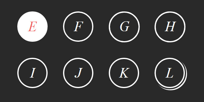
При проверке кроссбраузерности эффектов я нашел проблемы только с двумя эффектами в FireFox (в демо примере они на букве G и H).
В остальных браузерах (IE11, Opera, Chrome, Yandex) все пятнадцать эффектов работали как положено.
HTML
CSS
При проверке кроссбраузерности эффектов я нашел проблемы только с двумя эффектами в FireFox (в демо примере они на букве G и H).
В остальных браузерах (IE11, Opera, Chrome, Yandex) все пятнадцать эффектов работали как положено.
HTML
Код
<div class="row">
<div class="block">
<i class="hovicon effect-1 sub-a">A</i>
</div>
<div class="block">
<i class="hovicon effect-1 sub-b">B</i>
</div>
<div class="block">
<i class="hovicon effect-2 sub-a">C</i>
</div>
<div class="block">
<i class="hovicon effect-2 sub-b">D</i>
</div>
</div>
<div class="row">
<div class="block">
<i class="hovicon effect-3 sub-a">E</i>
</div>
<div class="block">
<i class="hovicon effect-3 sub-b">F</i>
</div>
<div class="block">
<i class="hovicon effect-4 sub-a">G</i>
</div>
<div class="block">
<i class="hovicon effect-4 sub-b">H</i>
</div>
</div>
<div class="row">
<div class="block">
<i class="hovicon effect-5 sub-a">I</i>
</div>
<div class="block">
<i class="hovicon effect-6">J</i>
</div>
<div class="block">
<i class="hovicon effect-7 sub-a">K</i>
</div>
<div class="block">
<i class="hovicon effect-7 sub-b">L</i>
</div>
</div>
<div class="row">
<div class="block">
<i class="hovicon effect-8">M</i>
</div>
<div class="block">
<i class="hovicon effect-9 sub-a">N</i>
</div>
<div class="block">
<i class="hovicon effect-9 sub-b">O</i>
</div>
</div>
<div class="block">
<i class="hovicon effect-1 sub-a">A</i>
</div>
<div class="block">
<i class="hovicon effect-1 sub-b">B</i>
</div>
<div class="block">
<i class="hovicon effect-2 sub-a">C</i>
</div>
<div class="block">
<i class="hovicon effect-2 sub-b">D</i>
</div>
</div>
<div class="row">
<div class="block">
<i class="hovicon effect-3 sub-a">E</i>
</div>
<div class="block">
<i class="hovicon effect-3 sub-b">F</i>
</div>
<div class="block">
<i class="hovicon effect-4 sub-a">G</i>
</div>
<div class="block">
<i class="hovicon effect-4 sub-b">H</i>
</div>
</div>
<div class="row">
<div class="block">
<i class="hovicon effect-5 sub-a">I</i>
</div>
<div class="block">
<i class="hovicon effect-6">J</i>
</div>
<div class="block">
<i class="hovicon effect-7 sub-a">K</i>
</div>
<div class="block">
<i class="hovicon effect-7 sub-b">L</i>
</div>
</div>
<div class="row">
<div class="block">
<i class="hovicon effect-8">M</i>
</div>
<div class="block">
<i class="hovicon effect-9 sub-a">N</i>
</div>
<div class="block">
<i class="hovicon effect-9 sub-b">O</i>
</div>
</div>
CSS
Код
.row {
float: left;
width: 100%;
}
.row .block {
float: left;
width: 25%;
height: 150px;
}
.hovicon {
display: inline-block;
font-size: 45px;
line-height: 90px;
cursor: pointer;
margin: 20px;
width: 90px;
height: 90px;
border-radius: 50%;
text-align: center;
position: relative;
text-decoration: none;
z-index: 1;
color: #fff;
}
.hovicon.small {
font-size: 20px;
line-height: 45px;
width: 45px;
height: 45px;
margin: 7px;
}
.hovicon.mini {
font-size: 15px;
line-height: 32px;
width: 30px;
height: 30px;
margin: 7px;
}
.hovicon.auto-width {
width: auto;
height: auto;
padding: 15px;
}
.hovicon:after {
pointer-events: none;
position: absolute;
width: 100%;
height: 100%;
border-radius: 50%;
content: '';
-webkit-box-sizing: content-box;
-moz-box-sizing: content-box;
box-sizing: content-box;
}
.hovicon:before {
speak: none;
font-size: 48px;
line-height: 90px;
font-style: normal;
font-weight: normal;
font-variant: normal;
text-transform: none;
display: block;
-webkit-font-smoothing: antialiased;
}
/* Effect 1 */
.hovicon.effect-1 {
background: rgba(255, 255, 255, 0.1);
-webkit-transition: background 0.2s, color 0.2s;
-moz-transition: background 0.2s, color 0.2s;
transition: background 0.2s, color 0.2s;
}
.hovicon.effect-1:after {
top: -7px;
left: -7px;
padding: 7px;
box-shadow: 0 0 0 4px #fff;
-webkit-transition: -webkit-transform 0.2s, opacity 0.2s;
-webkit-transform: scale(0.8);
-moz-transition: -moz-transform 0.2s, opacity 0.2s;
-moz-transform: scale(0.8);
-ms-transform: scale(0.8);
transition: transform 0.2s, opacity 0.2s;
transform: scale(0.8);
opacity: 0;
}
/* Effect 1a */
.hovicon.effect-1.sub-a:hover {
background: white;
color: #41ab6b;
}
.hovicon.effect-1.sub-a:hover i {
color: #41ab6b;
}
.hovicon.effect-1.sub-a:hover:after {
-webkit-transform: scale(1);
-moz-transform: scale(1);
-ms-transform: scale(1);
transform: scale(1);
opacity: 1;
}
/* Effect 1b */
.hovicon.effect-1.sub-b:hover {
background: white;
color: #41ab6b;
}
.hovicon.effect-1.sub-b:hover i {
color: #41ab6b;
}
.hovicon.effect-1.sub-b:after {
-webkit-transform: scale(1.2);
-moz-transform: scale(1.2);
-ms-transform: scale(1.2);
transform: scale(1.2);
}
.hovicon.effect-1.sub-b:hover:after {
-webkit-transform: scale(1);
-moz-transform: scale(1);
-ms-transform: scale(1);
transform: scale(1);
opacity: 1;
}
/* Effect 2 */
.hovicon.effect-2 {
color: #eea303;
box-shadow: 0 0 0 3px #fff;
-webkit-transition: color 0.3s;
-moz-transition: color 0.3s;
transition: color 0.3s;
}
.hovicon.effect-2:after {
top: -2px;
left: -2px;
padding: 2px;
z-index: -1;
background: #fff;
-webkit-transition: -webkit-transform 0.2s, opacity 0.2s;
-moz-transition: -moz-transform 0.2s, opacity 0.2s;
transition: transform 0.2s, opacity 0.2s;
}
/* Effect 2a */
.hovicon.effect-2.sub-a:hover, .hovicon.effect-2.sub-a:hover i {
color: #eea303;
}
.hovicon.effect-2.sub-a:hover:after {
-webkit-transform: scale(0.85);
-moz-transform: scale(0.85);
-ms-transform: scale(0.85);
transform: scale(0.85);
}
/* Effect 2b */
.hovicon.effect-2.sub-b:hover:after {
-webkit-transform: scale(0);
-moz-transform: scale(0);
-ms-transform: scale(0);
transform: scale(0);
opacity: 0;
-webkit-transition: -webkit-transform 0.4s, opacity 0.2s;
-moz-transition: -moz-transform 0.4s, opacity 0.2s;
transition: transform 0.4s, opacity 0.2s;
}
.hovicon.effect-2.sub-b:hover, .hovicon.effect-2.sub-b:hover i {
color: #fff;
}
/* Effect 3 */
.hovicon.effect-3 {
box-shadow: 0 0 0 4px #fff;
-webkit-transition: color 0.3s;
-moz-transition: color 0.3s;
transition: color 0.3s;
}
.hovicon.effect-3:after {
top: -2px;
left: -2px;
padding: 2px;
z-index: -1;
background: #fff;
-webkit-transition: -webkit-transform 0.2s, opacity 0.3s;
-moz-transition: -moz-transform 0.2s, opacity 0.3s;
transition: transform 0.2s, opacity 0.3s;
}
/* Effect 3a */
.hovicon.effect-3.sub-a, .hovicon.effect-3.sub-a i {
color: #f06060;
}
.hovicon.effect-3.sub-a:hover, .hovicon.effect-3.sub-a:hover i {
color: #fff;
}
.hovicon.effect-3.sub-a:hover:after {
-webkit-transform: scale(1.3);
-moz-transform: scale(1.3);
-ms-transform: scale(1.3);
transform: scale(1.3);
opacity: 0;
}
/* Effect 3b */
.hovicon.effect-3.sub-b, .hovicon.effect-3.sub-b i {
color: #fff;
}
.hovicon.effect-3.sub-b:hover, .hovicon.effect-3.sub-b:hover i {
color: #f06060;
}
.hovicon.effect-3.sub-b:after {
-webkit-transform: scale(1.3);
-moz-transform: scale(1.3);
-ms-transform: scale(1.3);
transform: scale(1.3);
opacity: 0;
}
.hovicon.effect-3.sub-b:hover:after {
-webkit-transform: scale(1);
-moz-transform: scale(1);
-ms-transform: scale(1);
transform: scale(1);
opacity: 1;
}
/* Effect 4 */
.hovicon.effect-4 {
width: 92px;
height: 92px;
box-shadow: 0 0 0 4px white;
}
.hovicon.effect-4.small {
width: 45px;
height: 45px;
}
.hovicon.effect-4.mini {
width: 30px;
height: 30px;
}
.hovicon.effect-4.sub-a {
-webkit-transition: box-shadow 0.2s;
-moz-transition: box-shadow 0.2s;
transition: box-shadow 0.2s;
}
.hovicon.effect-4:before {
line-height: 92px;
}
.hovicon.effect-4:after {
top: -4px;
left: -4px;
padding: 0;
z-index: 10;
border: 4px dashed #fff;
}
.hovicon.effect-4:hover {
box-shadow: 0 0 0 0 rgba(255, 255, 255, 0);
color: #fff;
}
.hovicon.effect-4:hover i {
color: #fff;
}
/* Effect 4b */
.hovicon.effect-4.sub-b:hover {
-webkit-transition: box-shadow 0.2s;
-moz-transition: box-shadow 0.2s;
transition: box-shadow 0.2s;
}
.hovicon.effect-4.sub-b:hover:after {
-webkit-animation: spinAround 9s linear infinite;
-moz-animation: spinAround 9s linear infinite;
animation: spinAround 9s linear infinite;
}
@-webkit-keyframes spinAround {
from {
-webkit-transform: rotate(0deg);
}
to {
-webkit-transform: rotate(360deg);
}
}
@-moz-keyframes spinAround {
from {
-moz-transform: rotate(0deg);
}
to {
-moz-transform: rotate(360deg);
}
}
@keyframes spinAround {
from {
transform: rotate(0deg);
}
to {
transform: rotate(360deg);
}
}
/* Effect 5 */
.hovicon.effect-5 {
box-shadow: 0 0 0 4px white;
overflow: hidden;
-webkit-transition: background 0.3s, color 0.3s, box-shadow 0.3s;
-moz-transition: background 0.3s, color 0.3s, box-shadow 0.3s;
transition: background 0.3s, color 0.3s, box-shadow 0.3s;
}
.hovicon.effect-5:after {
display: none;
}
.hovicon.effect-5:hover {
background: white;
color: #702fa8;
box-shadow: 0 0 0 8px rgba(255, 255, 255, 0.3);
}
.hovicon.effect-5:hover i {
color: #702fa8;
}
.hovicon.effect-5.sub-a:hover:before {
-webkit-animation: toRightFromLeft 0.3s forwards;
-moz-animation: toRightFromLeft 0.3s forwards;
animation: toRightFromLeft 0.3s forwards;
}
@-webkit-keyframes toRightFromLeft {
49% {
-webkit-transform: translate(100%);
}
50% {
opacity: 0;
-webkit-transform: translate(-100%);
}
51% {
opacity: 1;
}
}
@-moz-keyframes toRightFromLeft {
49% {
-moz-transform: translate(100%);
}
50% {
opacity: 0;
-moz-transform: translate(-100%);
}
51% {
opacity: 1;
}
}
@keyframes toRightFromLeft {
49% {
transform: translate(100%);
}
50% {
opacity: 0;
transform: translate(-100%);
}
51% {
opacity: 1;
}
}
.hovicon.effect-5.sub-b:hover:before {
-webkit-animation: toLeftFromRight 0.3s forwards;
-moz-animation: toLeftFromRight 0.3s forwards;
animation: toLeftFromRight 0.3s forwards;
}
@-webkit-keyframes toLeftFromRight {
49% {
-webkit-transform: translate(-100%);
}
50% {
opacity: 0;
-webkit-transform: translate(100%);
}
51% {
opacity: 1;
}
}
@-moz-keyframes toLeftFromRight {
49% {
-moz-transform: translate(-100%);
}
50% {
opacity: 0;
-moz-transform: translate(100%);
}
51% {
opacity: 1;
}
}
@keyframes toLeftFromRight {
49% {
transform: translate(-100%);
}
50% {
opacity: 0;
transform: translate(100%);
}
51% {
opacity: 1;
}
}
.hovicon.effect-5.sub-c:hover:before {
-webkit-animation: toTopFromBottom 0.3s forwards;
-moz-animation: toTopFromBottom 0.3s forwards;
animation: toTopFromBottom 0.3s forwards;
}
@-webkit-keyframes toTopFromBottom {
49% {
-webkit-transform: translateY(-100%);
}
50% {
opacity: 0;
-webkit-transform: translateY(100%);
}
51% {
opacity: 1;
}
}
@-moz-keyframes toTopFromBottom {
49% {
-moz-transform: translateY(-100%);
}
50% {
opacity: 0;
-moz-transform: translateY(100%);
}
51% {
opacity: 1;
}
}
@keyframes toTopFromBottom {
49% {
transform: translateY(-100%);
}
50% {
opacity: 0;
transform: translateY(100%);
}
51% {
opacity: 1;
}
}
.hovicon.effect-5.sub-d:hover:before {
-webkit-animation: toBottomFromTop 0.3s forwards;
-moz-animation: toBottomFromTop 0.3s forwards;
animation: toBottomFromTop 0.3s forwards;
}
@-webkit-keyframes toBottomFromTop {
49% {
-webkit-transform: translateY(100%);
}
50% {
opacity: 0;
-webkit-transform: translateY(-100%);
}
51% {
opacity: 1;
}
}
@-moz-keyframes toBottomFromTop {
49% {
-moz-transform: translateY(100%);
}
50% {
opacity: 0;
-moz-transform: translateY(-100%);
}
51% {
opacity: 1;
}
}
@keyframes toBottomFromTop {
49% {
transform: translateY(100%);
}
50% {
opacity: 0;
transform: translateY(-100%);
}
51% {
opacity: 1;
}
}
/* Effect 6 */
.hovicon.effect-6 {
box-shadow: 0 0 0 4px white;
-webkit-transition: background 0.2s, color 0.2s;
-moz-transition: background 0.2s, color 0.2s;
transition: background 0.2s, color 0.2s;
}
.hovicon.effect-6:hover {
background: white;
color: #64bb5d;
}
.hovicon.effect-6:hover i {
color: #64bb5d;
}
.hovicon.effect-6:hover:before {
-webkit-animation: spinAround 2s linear infinite;
-moz-animation: spinAround 2s linear infinite;
animation: spinAround 2s linear infinite;
}
/* Effect 7 */
.hovicon.effect-7 {
box-shadow: 0 0 0 4px white;
-webkit-transition: background 0.2s, color 0.2s;
-moz-transition: background 0.2s, color 0.2s;
transition: background 0.2s, color 0.2s;
}
.hovicon.effect-7:hover, .hovicon.effect-7:hover i {
color: #fff;
}
.hovicon.effect-7:after {
top: -8px;
left: -8px;
padding: 8px;
z-index: -1;
opacity: 0;
}
/* Effect 7a */
.hovicon.effect-7.sub-a:after {
box-shadow: 0 0 0 white;
-webkit-transition: opacity 0.2s, box-shadow 0.2s;
-moz-transition: opacity 0.2s, box-shadow 0.2s;
transition: opacity 0.2s, box-shadow 0.2s;
}
.hovicon.effect-7.sub-a:hover:after {
opacity: 1;
box-shadow: 3px 3px 0 white;
}
.hovicon.effect-7.sub-a:before {
-webkit-transform: scale(0.8);
-moz-transform: scale(0.8);
-ms-transform: scale(0.8);
transform: scale(0.8);
opacity: 0.7;
-webkit-transition: -webkit-transform 0.2s, opacity 0.2s;
-moz-transition: -moz-transform 0.2s, opacity 0.2s;
transition: transform 0.2s, opacity 0.2s;
}
.hovicon.effect-7.sub-a:hover:before {
-webkit-transform: scale(1);
-moz-transform: scale(1);
-ms-transform: scale(1);
transform: scale(1);
opacity: 1;
}
/* Effect 7b */
.hovicon.effect-7.sub-b:after {
box-shadow: 3px 3px white;
-webkit-transform: rotate(-90deg);
-moz-transform: rotate(-90deg);
-ms-transform: rotate(-90deg);
transform: rotate(-90deg);
-webkit-transition: opacity 0.2s, -webkit-transform 0.2s;
-moz-transition: opacity 0.2s, -moz-transform 0.2s;
transition: opacity 0.2s, transform 0.2s;
}
.hovicon.effect-7.sub-b:hover:after {
opacity: 1;
-webkit-transform: rotate(0deg);
-moz-transform: rotate(0deg);
-ms-transform: rotate(0deg);
transform: rotate(0deg);
}
.hovicon.effect-7.sub-b:before {
-webkit-transform: scale(0.8);
-moz-transform: scale(0.8);
-ms-transform: scale(0.8);
transform: scale(0.8);
opacity: 0.7;
-webkit-transition: -webkit-transform 0.2s, opacity 0.2s;
-moz-transition: -moz-transform 0.2s, opacity 0.2s;
transition: transform 0.2s, opacity 0.2s;
}
.hovicon.effect-7.sub-b:hover:before {
-webkit-transform: scale(1);
-moz-transform: scale(1);
-ms-transform: scale(1);
transform: scale(1);
opacity: 1;
}
/* Effect 8 */
.hovicon.effect-8 {
background: rgba(255, 255, 255, 0.1);
-webkit-transition: -webkit-transform ease-out 0.1s, background 0.2s;
-moz-transition: -moz-transform ease-out 0.1s, background 0.2s;
transition: transform ease-out 0.1s, background 0.2s;
}
.hovicon.effect-8:after {
top: 0;
left: 0;
padding: 0;
z-index: -1;
box-shadow: 0 0 0 2px rgba(255, 255, 255, 0.1);
opacity: 0;
-webkit-transform: scale(0.9);
-moz-transform: scale(0.9);
-ms-transform: scale(0.9);
transform: scale(0.9);
}
.hovicon.effect-8:hover {
background: rgba(255, 255, 255, 0.05);
-webkit-transform: scale(0.93);
-moz-transform: scale(0.93);
-ms-transform: scale(0.93);
transform: scale(0.93);
color: #fff;
}
.hovicon.effect-8:hover i {
color: #fff;
}
.hovicon.effect-8:hover:after {
-webkit-animation: sonarEffect 1.3s ease-out 75ms;
-moz-animation: sonarEffect 1.3s ease-out 75ms;
animation: sonarEffect 1.3s ease-out 75ms;
}
@-webkit-keyframes sonarEffect {
0% {
opacity: 0.3;
}
40% {
opacity: 0.5;
box-shadow: 0 0 0 2px rgba(255, 255, 255, 0.1), 0 0 10px 10px #3851bc, 0 0 0 10px rgba(255, 255, 255, 0.5);
}
100% {
box-shadow: 0 0 0 2px rgba(255, 255, 255, 0.1), 0 0 10px 10px #3851bc, 0 0 0 10px rgba(255, 255, 255, 0.5);
-webkit-transform: scale(1.5);
opacity: 0;
}
}
@-moz-keyframes sonarEffect {
0% {
opacity: 0.3;
}
40% {
opacity: 0.5;
box-shadow: 0 0 0 2px rgba(255, 255, 255, 0.1), 0 0 10px 10px #3851bc, 0 0 0 10px rgba(255, 255, 255, 0.5);
}
100% {
box-shadow: 0 0 0 2px rgba(255, 255, 255, 0.1), 0 0 10px 10px #3851bc, 0 0 0 10px rgba(255, 255, 255, 0.5);
-moz-transform: scale(1.5);
opacity: 0;
}
}
@keyframes sonarEffect {
0% {
opacity: 0.3;
}
40% {
opacity: 0.5;
box-shadow: 0 0 0 2px rgba(255, 255, 255, 0.1), 0 0 10px 10px #3851bc, 0 0 0 10px rgba(255, 255, 255, 0.5);
}
100% {
box-shadow: 0 0 0 2px rgba(255, 255, 255, 0.1), 0 0 10px 10px #3851bc, 0 0 0 10px rgba(255, 255, 255, 0.5);
transform: scale(1.5);
opacity: 0;
}
}
/* Effect 9 */
.hovicon.effect-9 {
-webkit-transition: box-shadow 0.2s;
-moz-transition: box-shadow 0.2s;
transition: box-shadow 0.2s;
}
.hovicon.effect-9:after {
top: 0;
left: 0;
padding: 0;
box-shadow: 0 0 0 3px #fff;
-webkit-transition: -webkit-transform 0.2s, opacity 0.2s;
-moz-transition: -moz-transform 0.2s, opacity 0.2s;
transition: transform 0.2s, opacity 0.2s;
}
/* Effect 9a */
.hovicon.effect-9.sub-a:hover:after {
-webkit-transform: scale(0.85);
-moz-transform: scale(0.85);
-ms-transform: scale(0.85);
transform: scale(0.85);
opacity: 0.5;
}
.hovicon.effect-9.sub-a:hover {
box-shadow: 0 0 0 10px white;
color: #fff;
}
.hovicon.effect-9.sub-a:hover i {
color: #fff;
}
/* Effect 9b */
.hovicon.effect-9.sub-b:hover:after {
-webkit-transform: scale(0.85);
-moz-transform: scale(0.85);
-ms-transform: scale(0.85);
transform: scale(0.85);
}
.hovicon.effect-9.sub-b:hover {
box-shadow: 0 0 0 10px rgba(255, 255, 255, 0.4);
color: #fff;
}
.hovicon.effect-9.sub-b:hover i {
color: #fff;
}
float: left;
width: 100%;
}
.row .block {
float: left;
width: 25%;
height: 150px;
}
.hovicon {
display: inline-block;
font-size: 45px;
line-height: 90px;
cursor: pointer;
margin: 20px;
width: 90px;
height: 90px;
border-radius: 50%;
text-align: center;
position: relative;
text-decoration: none;
z-index: 1;
color: #fff;
}
.hovicon.small {
font-size: 20px;
line-height: 45px;
width: 45px;
height: 45px;
margin: 7px;
}
.hovicon.mini {
font-size: 15px;
line-height: 32px;
width: 30px;
height: 30px;
margin: 7px;
}
.hovicon.auto-width {
width: auto;
height: auto;
padding: 15px;
}
.hovicon:after {
pointer-events: none;
position: absolute;
width: 100%;
height: 100%;
border-radius: 50%;
content: '';
-webkit-box-sizing: content-box;
-moz-box-sizing: content-box;
box-sizing: content-box;
}
.hovicon:before {
speak: none;
font-size: 48px;
line-height: 90px;
font-style: normal;
font-weight: normal;
font-variant: normal;
text-transform: none;
display: block;
-webkit-font-smoothing: antialiased;
}
/* Effect 1 */
.hovicon.effect-1 {
background: rgba(255, 255, 255, 0.1);
-webkit-transition: background 0.2s, color 0.2s;
-moz-transition: background 0.2s, color 0.2s;
transition: background 0.2s, color 0.2s;
}
.hovicon.effect-1:after {
top: -7px;
left: -7px;
padding: 7px;
box-shadow: 0 0 0 4px #fff;
-webkit-transition: -webkit-transform 0.2s, opacity 0.2s;
-webkit-transform: scale(0.8);
-moz-transition: -moz-transform 0.2s, opacity 0.2s;
-moz-transform: scale(0.8);
-ms-transform: scale(0.8);
transition: transform 0.2s, opacity 0.2s;
transform: scale(0.8);
opacity: 0;
}
/* Effect 1a */
.hovicon.effect-1.sub-a:hover {
background: white;
color: #41ab6b;
}
.hovicon.effect-1.sub-a:hover i {
color: #41ab6b;
}
.hovicon.effect-1.sub-a:hover:after {
-webkit-transform: scale(1);
-moz-transform: scale(1);
-ms-transform: scale(1);
transform: scale(1);
opacity: 1;
}
/* Effect 1b */
.hovicon.effect-1.sub-b:hover {
background: white;
color: #41ab6b;
}
.hovicon.effect-1.sub-b:hover i {
color: #41ab6b;
}
.hovicon.effect-1.sub-b:after {
-webkit-transform: scale(1.2);
-moz-transform: scale(1.2);
-ms-transform: scale(1.2);
transform: scale(1.2);
}
.hovicon.effect-1.sub-b:hover:after {
-webkit-transform: scale(1);
-moz-transform: scale(1);
-ms-transform: scale(1);
transform: scale(1);
opacity: 1;
}
/* Effect 2 */
.hovicon.effect-2 {
color: #eea303;
box-shadow: 0 0 0 3px #fff;
-webkit-transition: color 0.3s;
-moz-transition: color 0.3s;
transition: color 0.3s;
}
.hovicon.effect-2:after {
top: -2px;
left: -2px;
padding: 2px;
z-index: -1;
background: #fff;
-webkit-transition: -webkit-transform 0.2s, opacity 0.2s;
-moz-transition: -moz-transform 0.2s, opacity 0.2s;
transition: transform 0.2s, opacity 0.2s;
}
/* Effect 2a */
.hovicon.effect-2.sub-a:hover, .hovicon.effect-2.sub-a:hover i {
color: #eea303;
}
.hovicon.effect-2.sub-a:hover:after {
-webkit-transform: scale(0.85);
-moz-transform: scale(0.85);
-ms-transform: scale(0.85);
transform: scale(0.85);
}
/* Effect 2b */
.hovicon.effect-2.sub-b:hover:after {
-webkit-transform: scale(0);
-moz-transform: scale(0);
-ms-transform: scale(0);
transform: scale(0);
opacity: 0;
-webkit-transition: -webkit-transform 0.4s, opacity 0.2s;
-moz-transition: -moz-transform 0.4s, opacity 0.2s;
transition: transform 0.4s, opacity 0.2s;
}
.hovicon.effect-2.sub-b:hover, .hovicon.effect-2.sub-b:hover i {
color: #fff;
}
/* Effect 3 */
.hovicon.effect-3 {
box-shadow: 0 0 0 4px #fff;
-webkit-transition: color 0.3s;
-moz-transition: color 0.3s;
transition: color 0.3s;
}
.hovicon.effect-3:after {
top: -2px;
left: -2px;
padding: 2px;
z-index: -1;
background: #fff;
-webkit-transition: -webkit-transform 0.2s, opacity 0.3s;
-moz-transition: -moz-transform 0.2s, opacity 0.3s;
transition: transform 0.2s, opacity 0.3s;
}
/* Effect 3a */
.hovicon.effect-3.sub-a, .hovicon.effect-3.sub-a i {
color: #f06060;
}
.hovicon.effect-3.sub-a:hover, .hovicon.effect-3.sub-a:hover i {
color: #fff;
}
.hovicon.effect-3.sub-a:hover:after {
-webkit-transform: scale(1.3);
-moz-transform: scale(1.3);
-ms-transform: scale(1.3);
transform: scale(1.3);
opacity: 0;
}
/* Effect 3b */
.hovicon.effect-3.sub-b, .hovicon.effect-3.sub-b i {
color: #fff;
}
.hovicon.effect-3.sub-b:hover, .hovicon.effect-3.sub-b:hover i {
color: #f06060;
}
.hovicon.effect-3.sub-b:after {
-webkit-transform: scale(1.3);
-moz-transform: scale(1.3);
-ms-transform: scale(1.3);
transform: scale(1.3);
opacity: 0;
}
.hovicon.effect-3.sub-b:hover:after {
-webkit-transform: scale(1);
-moz-transform: scale(1);
-ms-transform: scale(1);
transform: scale(1);
opacity: 1;
}
/* Effect 4 */
.hovicon.effect-4 {
width: 92px;
height: 92px;
box-shadow: 0 0 0 4px white;
}
.hovicon.effect-4.small {
width: 45px;
height: 45px;
}
.hovicon.effect-4.mini {
width: 30px;
height: 30px;
}
.hovicon.effect-4.sub-a {
-webkit-transition: box-shadow 0.2s;
-moz-transition: box-shadow 0.2s;
transition: box-shadow 0.2s;
}
.hovicon.effect-4:before {
line-height: 92px;
}
.hovicon.effect-4:after {
top: -4px;
left: -4px;
padding: 0;
z-index: 10;
border: 4px dashed #fff;
}
.hovicon.effect-4:hover {
box-shadow: 0 0 0 0 rgba(255, 255, 255, 0);
color: #fff;
}
.hovicon.effect-4:hover i {
color: #fff;
}
/* Effect 4b */
.hovicon.effect-4.sub-b:hover {
-webkit-transition: box-shadow 0.2s;
-moz-transition: box-shadow 0.2s;
transition: box-shadow 0.2s;
}
.hovicon.effect-4.sub-b:hover:after {
-webkit-animation: spinAround 9s linear infinite;
-moz-animation: spinAround 9s linear infinite;
animation: spinAround 9s linear infinite;
}
@-webkit-keyframes spinAround {
from {
-webkit-transform: rotate(0deg);
}
to {
-webkit-transform: rotate(360deg);
}
}
@-moz-keyframes spinAround {
from {
-moz-transform: rotate(0deg);
}
to {
-moz-transform: rotate(360deg);
}
}
@keyframes spinAround {
from {
transform: rotate(0deg);
}
to {
transform: rotate(360deg);
}
}
/* Effect 5 */
.hovicon.effect-5 {
box-shadow: 0 0 0 4px white;
overflow: hidden;
-webkit-transition: background 0.3s, color 0.3s, box-shadow 0.3s;
-moz-transition: background 0.3s, color 0.3s, box-shadow 0.3s;
transition: background 0.3s, color 0.3s, box-shadow 0.3s;
}
.hovicon.effect-5:after {
display: none;
}
.hovicon.effect-5:hover {
background: white;
color: #702fa8;
box-shadow: 0 0 0 8px rgba(255, 255, 255, 0.3);
}
.hovicon.effect-5:hover i {
color: #702fa8;
}
.hovicon.effect-5.sub-a:hover:before {
-webkit-animation: toRightFromLeft 0.3s forwards;
-moz-animation: toRightFromLeft 0.3s forwards;
animation: toRightFromLeft 0.3s forwards;
}
@-webkit-keyframes toRightFromLeft {
49% {
-webkit-transform: translate(100%);
}
50% {
opacity: 0;
-webkit-transform: translate(-100%);
}
51% {
opacity: 1;
}
}
@-moz-keyframes toRightFromLeft {
49% {
-moz-transform: translate(100%);
}
50% {
opacity: 0;
-moz-transform: translate(-100%);
}
51% {
opacity: 1;
}
}
@keyframes toRightFromLeft {
49% {
transform: translate(100%);
}
50% {
opacity: 0;
transform: translate(-100%);
}
51% {
opacity: 1;
}
}
.hovicon.effect-5.sub-b:hover:before {
-webkit-animation: toLeftFromRight 0.3s forwards;
-moz-animation: toLeftFromRight 0.3s forwards;
animation: toLeftFromRight 0.3s forwards;
}
@-webkit-keyframes toLeftFromRight {
49% {
-webkit-transform: translate(-100%);
}
50% {
opacity: 0;
-webkit-transform: translate(100%);
}
51% {
opacity: 1;
}
}
@-moz-keyframes toLeftFromRight {
49% {
-moz-transform: translate(-100%);
}
50% {
opacity: 0;
-moz-transform: translate(100%);
}
51% {
opacity: 1;
}
}
@keyframes toLeftFromRight {
49% {
transform: translate(-100%);
}
50% {
opacity: 0;
transform: translate(100%);
}
51% {
opacity: 1;
}
}
.hovicon.effect-5.sub-c:hover:before {
-webkit-animation: toTopFromBottom 0.3s forwards;
-moz-animation: toTopFromBottom 0.3s forwards;
animation: toTopFromBottom 0.3s forwards;
}
@-webkit-keyframes toTopFromBottom {
49% {
-webkit-transform: translateY(-100%);
}
50% {
opacity: 0;
-webkit-transform: translateY(100%);
}
51% {
opacity: 1;
}
}
@-moz-keyframes toTopFromBottom {
49% {
-moz-transform: translateY(-100%);
}
50% {
opacity: 0;
-moz-transform: translateY(100%);
}
51% {
opacity: 1;
}
}
@keyframes toTopFromBottom {
49% {
transform: translateY(-100%);
}
50% {
opacity: 0;
transform: translateY(100%);
}
51% {
opacity: 1;
}
}
.hovicon.effect-5.sub-d:hover:before {
-webkit-animation: toBottomFromTop 0.3s forwards;
-moz-animation: toBottomFromTop 0.3s forwards;
animation: toBottomFromTop 0.3s forwards;
}
@-webkit-keyframes toBottomFromTop {
49% {
-webkit-transform: translateY(100%);
}
50% {
opacity: 0;
-webkit-transform: translateY(-100%);
}
51% {
opacity: 1;
}
}
@-moz-keyframes toBottomFromTop {
49% {
-moz-transform: translateY(100%);
}
50% {
opacity: 0;
-moz-transform: translateY(-100%);
}
51% {
opacity: 1;
}
}
@keyframes toBottomFromTop {
49% {
transform: translateY(100%);
}
50% {
opacity: 0;
transform: translateY(-100%);
}
51% {
opacity: 1;
}
}
/* Effect 6 */
.hovicon.effect-6 {
box-shadow: 0 0 0 4px white;
-webkit-transition: background 0.2s, color 0.2s;
-moz-transition: background 0.2s, color 0.2s;
transition: background 0.2s, color 0.2s;
}
.hovicon.effect-6:hover {
background: white;
color: #64bb5d;
}
.hovicon.effect-6:hover i {
color: #64bb5d;
}
.hovicon.effect-6:hover:before {
-webkit-animation: spinAround 2s linear infinite;
-moz-animation: spinAround 2s linear infinite;
animation: spinAround 2s linear infinite;
}
/* Effect 7 */
.hovicon.effect-7 {
box-shadow: 0 0 0 4px white;
-webkit-transition: background 0.2s, color 0.2s;
-moz-transition: background 0.2s, color 0.2s;
transition: background 0.2s, color 0.2s;
}
.hovicon.effect-7:hover, .hovicon.effect-7:hover i {
color: #fff;
}
.hovicon.effect-7:after {
top: -8px;
left: -8px;
padding: 8px;
z-index: -1;
opacity: 0;
}
/* Effect 7a */
.hovicon.effect-7.sub-a:after {
box-shadow: 0 0 0 white;
-webkit-transition: opacity 0.2s, box-shadow 0.2s;
-moz-transition: opacity 0.2s, box-shadow 0.2s;
transition: opacity 0.2s, box-shadow 0.2s;
}
.hovicon.effect-7.sub-a:hover:after {
opacity: 1;
box-shadow: 3px 3px 0 white;
}
.hovicon.effect-7.sub-a:before {
-webkit-transform: scale(0.8);
-moz-transform: scale(0.8);
-ms-transform: scale(0.8);
transform: scale(0.8);
opacity: 0.7;
-webkit-transition: -webkit-transform 0.2s, opacity 0.2s;
-moz-transition: -moz-transform 0.2s, opacity 0.2s;
transition: transform 0.2s, opacity 0.2s;
}
.hovicon.effect-7.sub-a:hover:before {
-webkit-transform: scale(1);
-moz-transform: scale(1);
-ms-transform: scale(1);
transform: scale(1);
opacity: 1;
}
/* Effect 7b */
.hovicon.effect-7.sub-b:after {
box-shadow: 3px 3px white;
-webkit-transform: rotate(-90deg);
-moz-transform: rotate(-90deg);
-ms-transform: rotate(-90deg);
transform: rotate(-90deg);
-webkit-transition: opacity 0.2s, -webkit-transform 0.2s;
-moz-transition: opacity 0.2s, -moz-transform 0.2s;
transition: opacity 0.2s, transform 0.2s;
}
.hovicon.effect-7.sub-b:hover:after {
opacity: 1;
-webkit-transform: rotate(0deg);
-moz-transform: rotate(0deg);
-ms-transform: rotate(0deg);
transform: rotate(0deg);
}
.hovicon.effect-7.sub-b:before {
-webkit-transform: scale(0.8);
-moz-transform: scale(0.8);
-ms-transform: scale(0.8);
transform: scale(0.8);
opacity: 0.7;
-webkit-transition: -webkit-transform 0.2s, opacity 0.2s;
-moz-transition: -moz-transform 0.2s, opacity 0.2s;
transition: transform 0.2s, opacity 0.2s;
}
.hovicon.effect-7.sub-b:hover:before {
-webkit-transform: scale(1);
-moz-transform: scale(1);
-ms-transform: scale(1);
transform: scale(1);
opacity: 1;
}
/* Effect 8 */
.hovicon.effect-8 {
background: rgba(255, 255, 255, 0.1);
-webkit-transition: -webkit-transform ease-out 0.1s, background 0.2s;
-moz-transition: -moz-transform ease-out 0.1s, background 0.2s;
transition: transform ease-out 0.1s, background 0.2s;
}
.hovicon.effect-8:after {
top: 0;
left: 0;
padding: 0;
z-index: -1;
box-shadow: 0 0 0 2px rgba(255, 255, 255, 0.1);
opacity: 0;
-webkit-transform: scale(0.9);
-moz-transform: scale(0.9);
-ms-transform: scale(0.9);
transform: scale(0.9);
}
.hovicon.effect-8:hover {
background: rgba(255, 255, 255, 0.05);
-webkit-transform: scale(0.93);
-moz-transform: scale(0.93);
-ms-transform: scale(0.93);
transform: scale(0.93);
color: #fff;
}
.hovicon.effect-8:hover i {
color: #fff;
}
.hovicon.effect-8:hover:after {
-webkit-animation: sonarEffect 1.3s ease-out 75ms;
-moz-animation: sonarEffect 1.3s ease-out 75ms;
animation: sonarEffect 1.3s ease-out 75ms;
}
@-webkit-keyframes sonarEffect {
0% {
opacity: 0.3;
}
40% {
opacity: 0.5;
box-shadow: 0 0 0 2px rgba(255, 255, 255, 0.1), 0 0 10px 10px #3851bc, 0 0 0 10px rgba(255, 255, 255, 0.5);
}
100% {
box-shadow: 0 0 0 2px rgba(255, 255, 255, 0.1), 0 0 10px 10px #3851bc, 0 0 0 10px rgba(255, 255, 255, 0.5);
-webkit-transform: scale(1.5);
opacity: 0;
}
}
@-moz-keyframes sonarEffect {
0% {
opacity: 0.3;
}
40% {
opacity: 0.5;
box-shadow: 0 0 0 2px rgba(255, 255, 255, 0.1), 0 0 10px 10px #3851bc, 0 0 0 10px rgba(255, 255, 255, 0.5);
}
100% {
box-shadow: 0 0 0 2px rgba(255, 255, 255, 0.1), 0 0 10px 10px #3851bc, 0 0 0 10px rgba(255, 255, 255, 0.5);
-moz-transform: scale(1.5);
opacity: 0;
}
}
@keyframes sonarEffect {
0% {
opacity: 0.3;
}
40% {
opacity: 0.5;
box-shadow: 0 0 0 2px rgba(255, 255, 255, 0.1), 0 0 10px 10px #3851bc, 0 0 0 10px rgba(255, 255, 255, 0.5);
}
100% {
box-shadow: 0 0 0 2px rgba(255, 255, 255, 0.1), 0 0 10px 10px #3851bc, 0 0 0 10px rgba(255, 255, 255, 0.5);
transform: scale(1.5);
opacity: 0;
}
}
/* Effect 9 */
.hovicon.effect-9 {
-webkit-transition: box-shadow 0.2s;
-moz-transition: box-shadow 0.2s;
transition: box-shadow 0.2s;
}
.hovicon.effect-9:after {
top: 0;
left: 0;
padding: 0;
box-shadow: 0 0 0 3px #fff;
-webkit-transition: -webkit-transform 0.2s, opacity 0.2s;
-moz-transition: -moz-transform 0.2s, opacity 0.2s;
transition: transform 0.2s, opacity 0.2s;
}
/* Effect 9a */
.hovicon.effect-9.sub-a:hover:after {
-webkit-transform: scale(0.85);
-moz-transform: scale(0.85);
-ms-transform: scale(0.85);
transform: scale(0.85);
opacity: 0.5;
}
.hovicon.effect-9.sub-a:hover {
box-shadow: 0 0 0 10px white;
color: #fff;
}
.hovicon.effect-9.sub-a:hover i {
color: #fff;
}
/* Effect 9b */
.hovicon.effect-9.sub-b:hover:after {
-webkit-transform: scale(0.85);
-moz-transform: scale(0.85);
-ms-transform: scale(0.85);
transform: scale(0.85);
}
.hovicon.effect-9.sub-b:hover {
box-shadow: 0 0 0 10px rgba(255, 255, 255, 0.4);
color: #fff;
}
.hovicon.effect-9.sub-b:hover i {
color: #fff;
}